Monday, November 15, 2010

Charts and Graphs


I struggled a lot trying to figure out what kind of data I was going to work with. The first thing I struggled with was reading the assignment carefully. I started using statistical data from the town of Bristol instead of having it relate to RWU. I then looked on the school website in order to find some kind of data I could use. I decided to do the demographics of Roger Williams students. I made a chart on excel and could not figure out how to delete the unnecessary rows and columns that were already established. I decided to take a screen shot and eliminate those extra rows. Probably not the best decision, but I was desperate.

The best part of Excel is that it has the layout all ready for you. I decided the best graphs to represent my information would be a bar graph and a pie graph. This way there is an obvious relationship between the data that shows the majorities and the minorities. From my graph it is obvious that there is a lot more white students than anyone else.

Thursday, November 11, 2010

Flow Charts


For this assignment I had to actually perform the task of finding a book in order to fully capture all of the steps necessary. I had trouble at first, and had to redo the picture three times because it looked too messy the first time. I had to cut down the steps because I had too many and for purposes of space and clarity I thought it would be better if I had the basics only.

Tuesday, November 9, 2010

Explanation Graphics


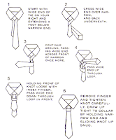
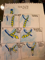
For my explanation graphic, I added color to the illustrations to help create a more realistic appeal to the audience. I made the pictures bigger and cut out a lot of the text in order to avoid confusion. It turns out that it is a lot more difficult to to explain how to tie a tie without using a lot of text. The best way seems to be through a video where the audience can see step by step what to do. Something that I learned from this was that color can help bring out an image, and by using text and pictures together it makes it easier for someone who doesn't know what they are doing to remember the steps in the future.

I had a lot of trouble figuring out how to change the explanation graphic. I tried to do it on photoshop and add the color and change the graphic but it ended up a big mess. I ended up with a finish project that didn't do a good job explaining and looked completely different than what I wanted it to be. I decided to draw it manually and add the color and redraw the tie bigger and with depth and better instruction.

How to Cook a Spaghetti Dinner


For this assignment, although it seems easy enough to explain how to make a simple spaghetti dinner, I struggled with communicating the individual steps through pictures. I struggle with free hand drawing in general, but I felt as though my pictures were not sufficient in explaining the necessary steps. I started out with the materials necessary to start out with. If I were to redo this assignment I would have either taken out that part because it is confusing or made a distinction between that and the steps necessary to perform the task.