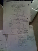
When deciding what we would do for the final project we knew that we wanted our visual to be a flow chart. We thought up many ways to show the flow chart in a 3D format that was different from the usual display. Once we had these ideas, we had to come up with the topic for the flow chart. It was hard to narrow down the entire semester into one flow chart so we decided to focus on the main concept that we should get out of the class. We this main concept is: how to know if your visual is effectively communicating.
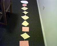
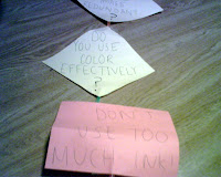
When constructing the flow chart we came across problems on how to put each of the decisions, questions, terminators, and lines together. Some of the options we came up with were a 3D pull out version, a smaller on paper version, and then a larger more novelty sized display. When trying to construct this there were problems making everything fit. The chart was too big to fit together, so we had to cut some of the boxes down to make the chart more portable and easier to see
We choose to use the novelty sized version because our audience is a lazy student in the last row that has not paid attention all semester. His name is Joe, he is a sophomore whose major is Global Communications. We figured the bright colors of the process boxes and the size of the writing would grab their attention from the back row.
Through looking at our chart they can learn how to: properly use color and hierarchy, fix redundancy, tell the truth about data, design for their audience, use the least amount of ink when printing, and overall reduce the cognitive load. Through the flow chart it gives each of these steps on how to fix them which will result in an effective visual display. The flow chart was the best way to display this information, it flows well together and it gives easy solutions to design problems one might run into.
Ideally, my thought for the project was to make a concrete model of what a flow chart would look like. When I draw it on paper it doesn't necessarily make it stand out as much as having one that comes off the paper and is taller than I am. I thought it was a good way to give a flow chart a different feeling than just another chart we learned how to do in class. We started to get overwhelmed with it because we thought it was getting too big I was worried we were going to have to start all over again. We decided to cut some of the paper so it didn't look as big and made it a few feet shorter which seemed to work out well. I think overall it came together pretty well and became a good looking project. I think it captured the assignment because we were able to demonstrate two things in one that we learned from Visual Communications, that is how to communicate a visual properly and how to make and use a flow chart.


